
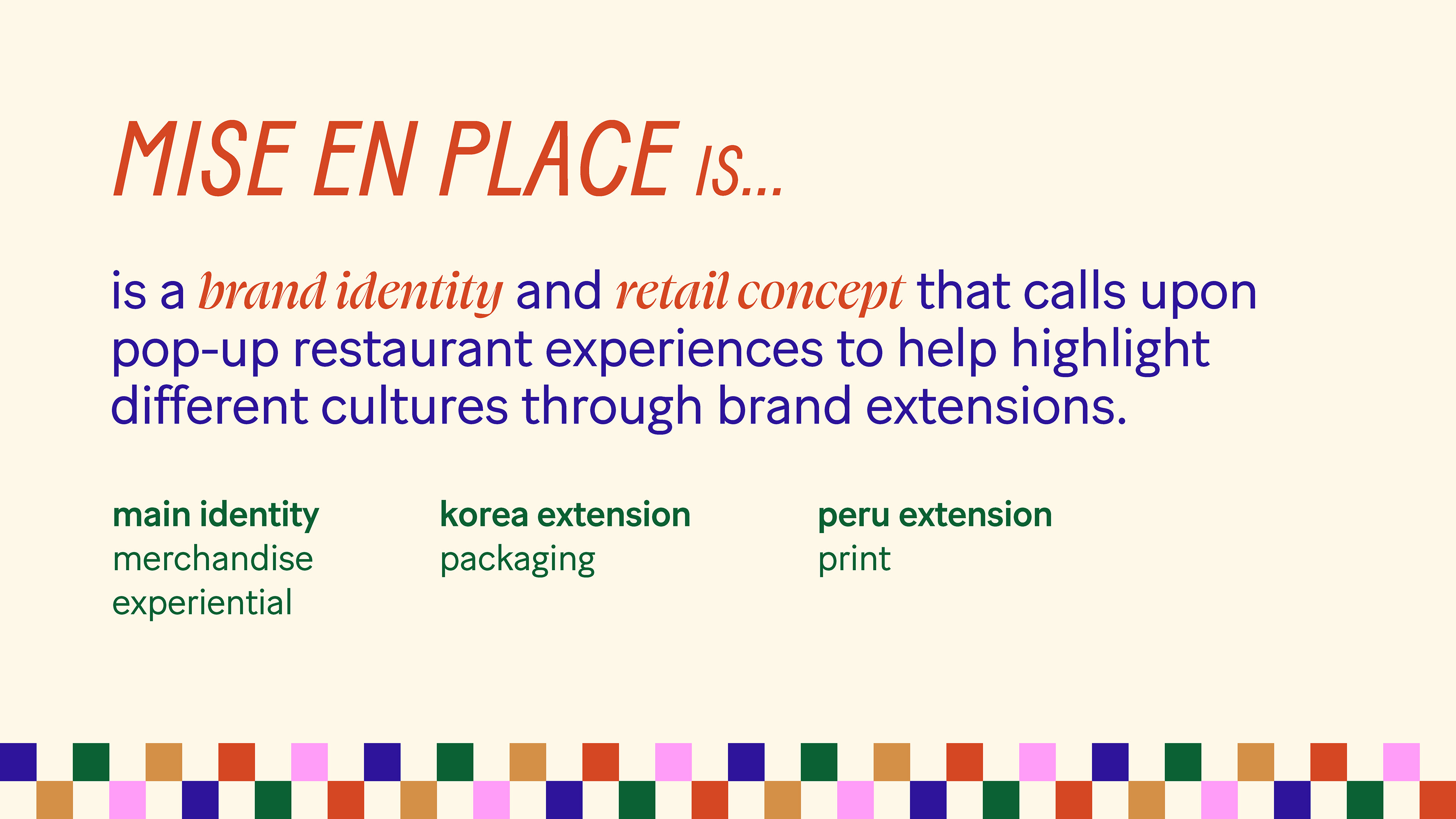
Mise en Place is a brand identity, packaging, and pop-up style retail concept that tries to incorporate cultural foods into people's every day lives, while at the same time creating comfort and understanding in the kitchen. Growing up as a second generation immigrant in the United States, I am very familiar with the shifting attitudes around food, and what happens when a culture changes from something I was ashamed of, to something that was worthy of intrigue.
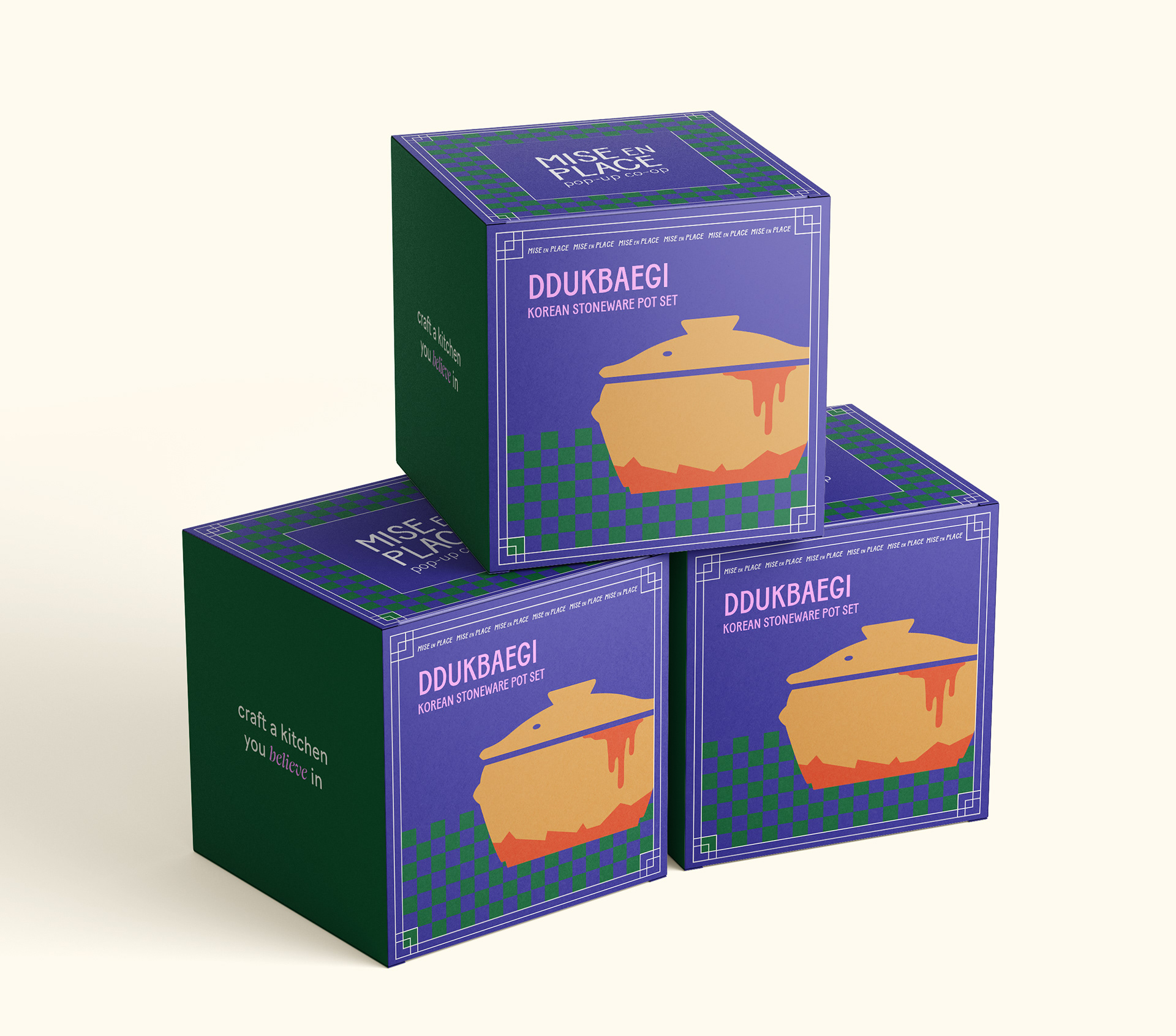
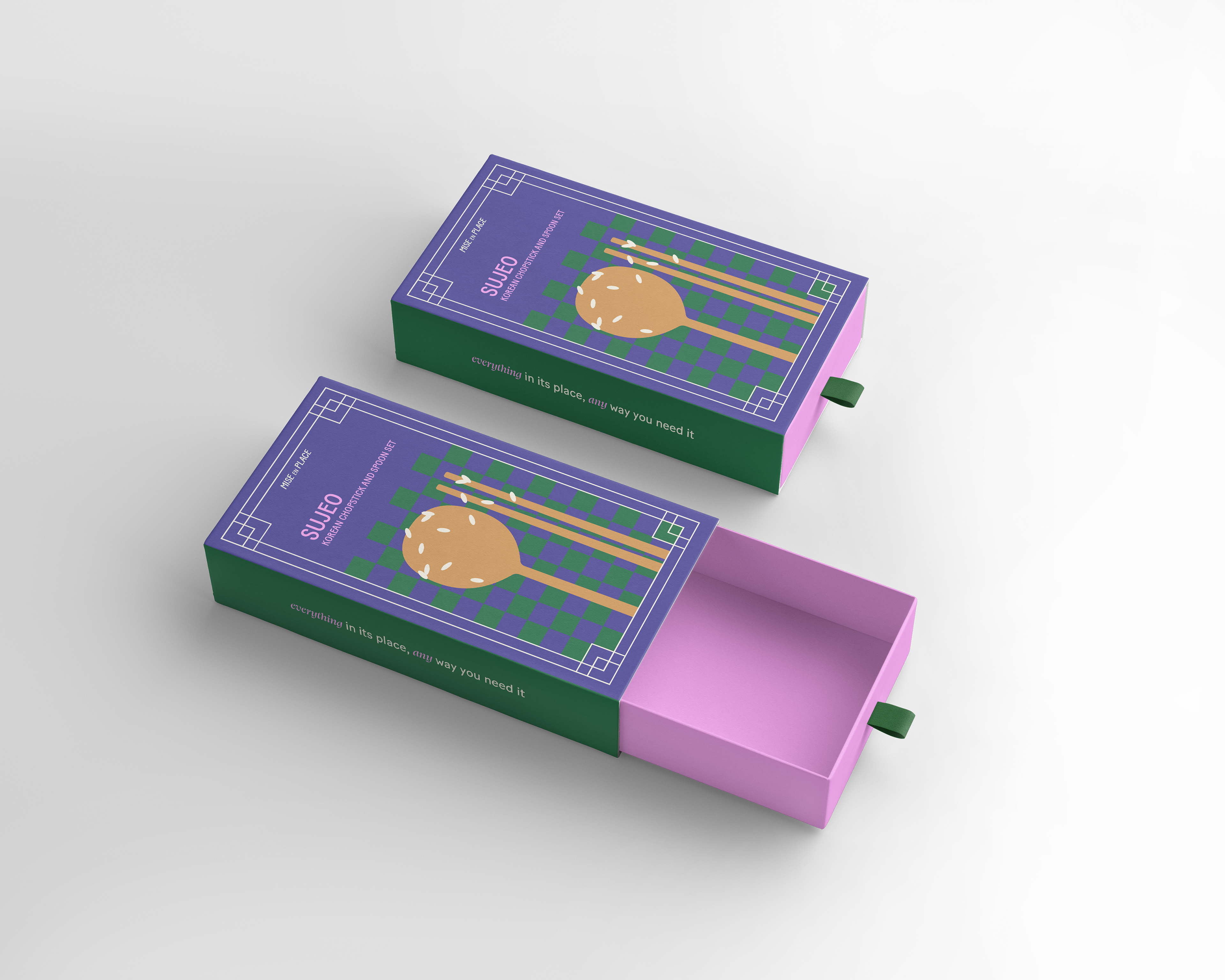
Mise en Place is made up of three moving parts, with opportunity to expand in any direction. With using a versatile main identity which calls upon pop-up restaurants and retro design aesthetics, this pulls a young adult audience with less cooking experience.
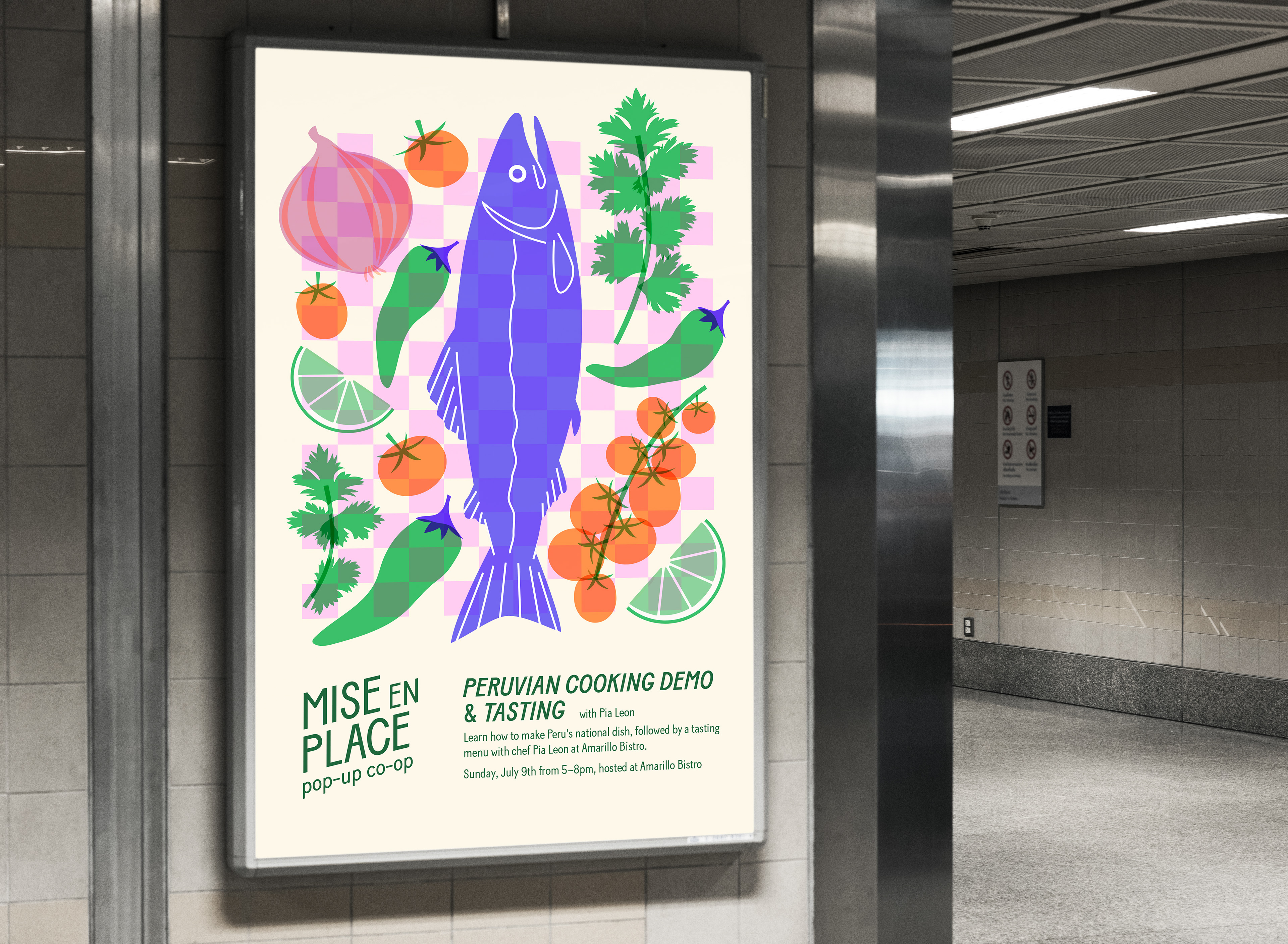
In terms of deliverables, the project consisted of various physical media, including print and packaging elements. I am very intrigued by different methods of printing, and wanted to explore the risograph printing, which informed my color choice, visual aesthetic, and deliverables.


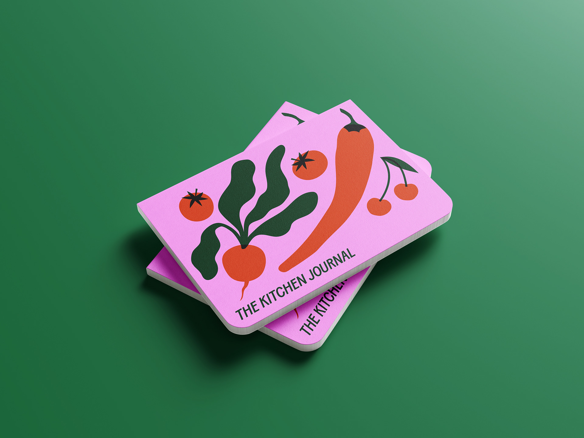
cooking journal
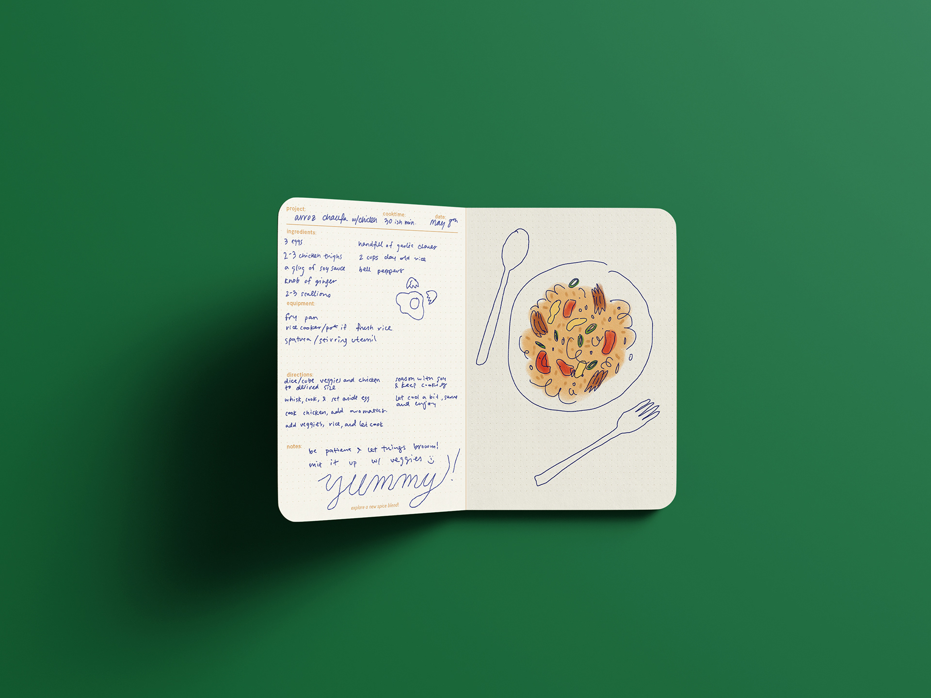
marked up jounral interior, with blank space for extra notes, sketches, food stains...
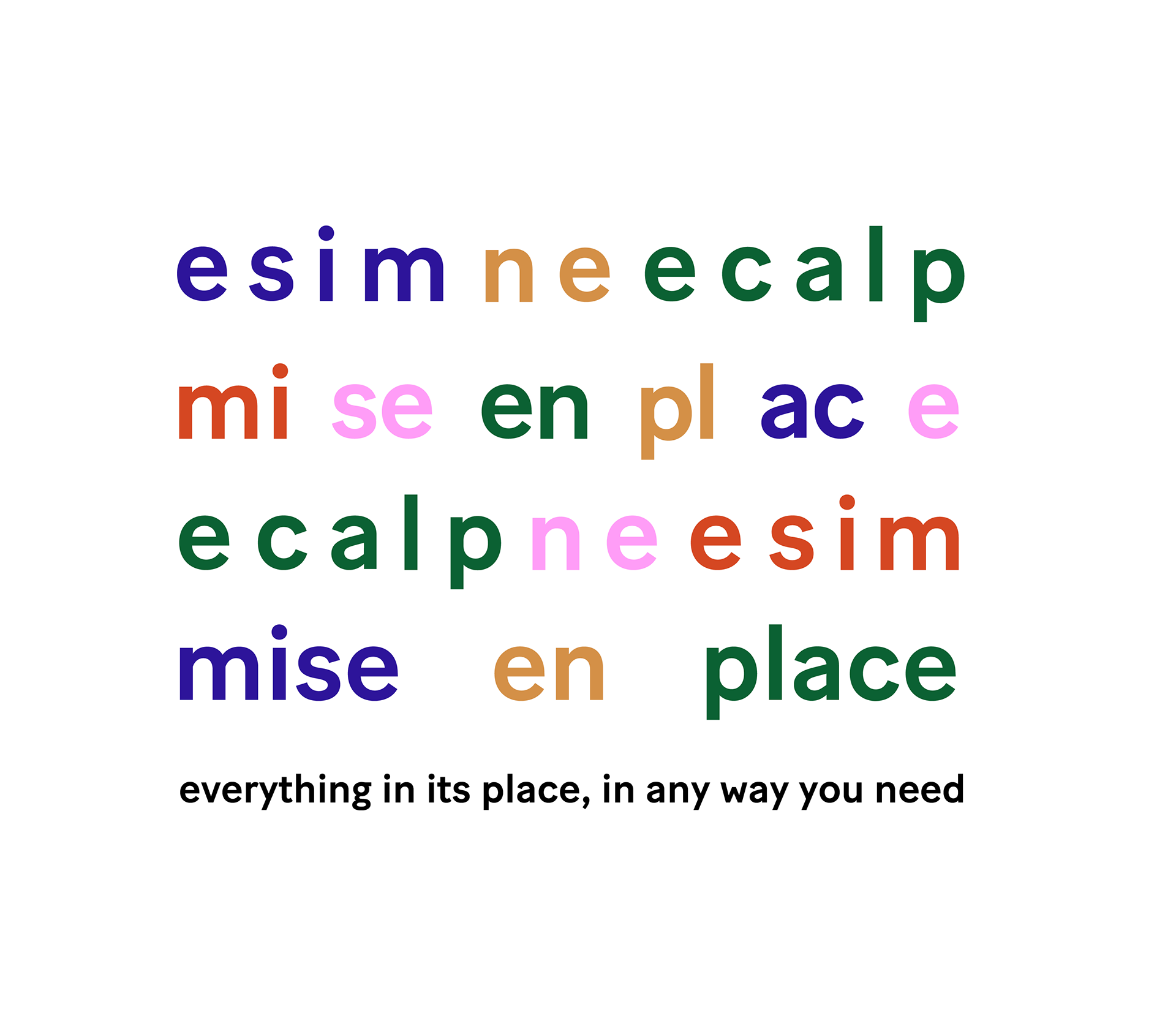
The "word salad" design, speaking to the variable and DIY feel of the identity.

Die-cut sticker set inspired by fruit stickers and handwritten meal tickets.
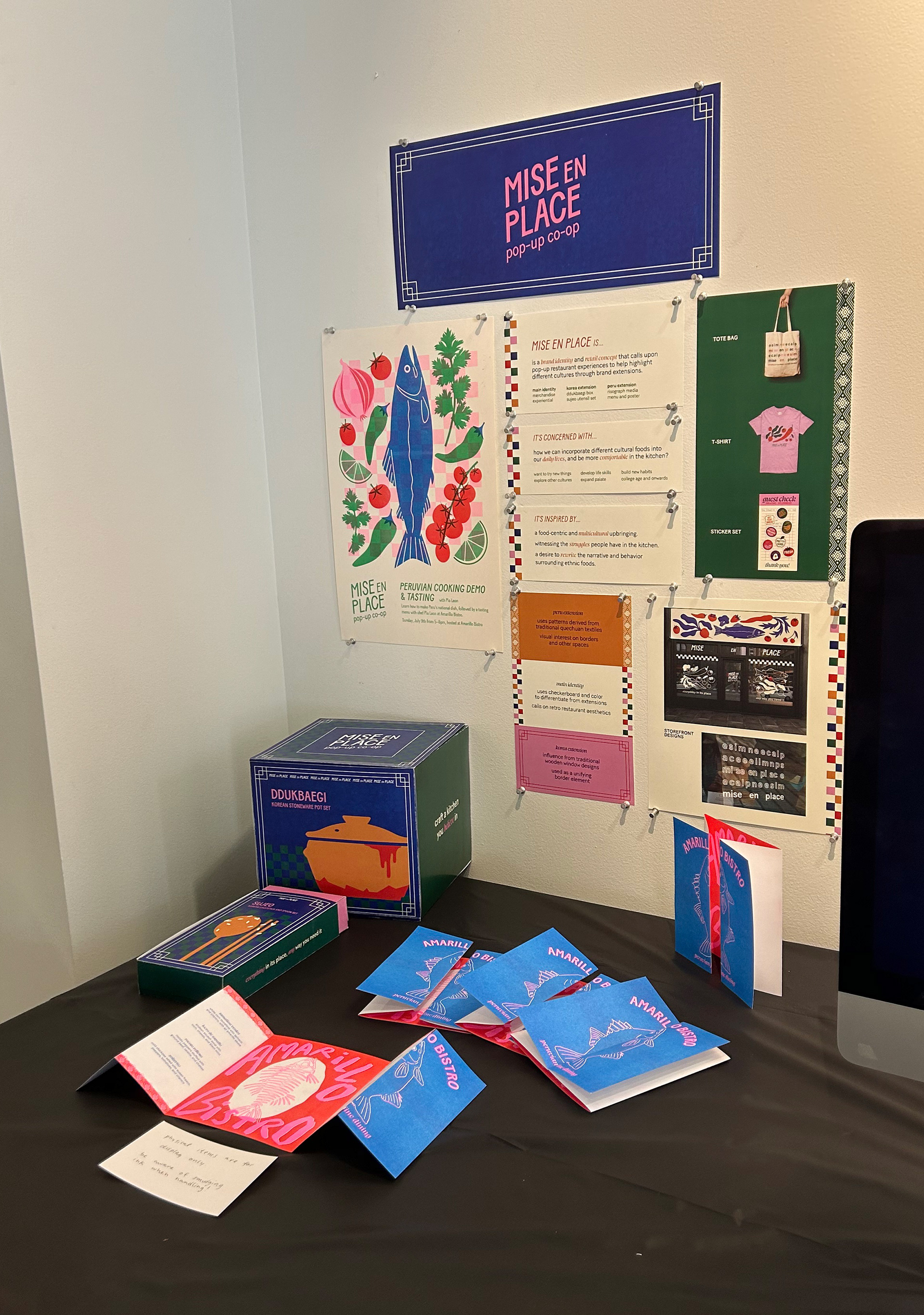
Mise en Place Capstone exhibition display.